Ordination is a technique to take high-dimensional data and to represent it in a lower dimensional context.
Lecture Materials
Below are the slides that are used in the lecture component of this topic. You can cycle through them using the cursor arrows or open the online version in a new browser window.
Ordination is a collective term for multivariate techniques which summarize a multidimensional dataset in such a way that when it is projected onto a low dimensional space, any intrinsic pattern the data may possess becomes apparent upon visual inspection1.
One of the largest challenges in data analysis is the ability to understand and gain inferences from it! This is especially compounded when we have many different kinds of data describing our individual observations. For example, at a particular vernal pool, we may have measured pool size, pool depth, elevation, rainfall, temperature, canopy cover, pH, aquatic vegitation, species1 density, species2 density, etc. To describe all of these variables we could either plot all combinations of them or be a bit clever and use some ordination approaches.
For this activity, I am going to use the beer styles as a data set in explaining a couple of different types of ordination. It is available as the raw CSV file.
    Styles             Yeast       ABV_Min         ABV_Max
 Length:100         Ale   :69   Min.   :2.400   Min.   : 3.200
 Class :character   Either: 4   1st Qu.:4.200   1st Qu.: 5.475
 Mode  :character   Lager :27   Median :4.600   Median : 6.000
                                Mean   :4.947   Mean   : 6.768
                                3rd Qu.:5.500   3rd Qu.: 8.000
                                Max.   :9.000   Max.   :14.000
    IBU_Min         IBU_Max          SRM_Min         SRM_Max
 Min.   : 0.00   Min.   :  8.00   Min.   : 2.00   Min.   : 3.00
 1st Qu.:15.00   1st Qu.: 25.00   1st Qu.: 3.50   1st Qu.: 7.00
 Median :20.00   Median : 35.00   Median : 8.00   Median :17.00
 Mean   :21.97   Mean   : 38.98   Mean   : 9.82   Mean   :17.76
 3rd Qu.:25.00   3rd Qu.: 45.00   3rd Qu.:14.00   3rd Qu.:22.00
 Max.   :60.00   Max.   :120.00   Max.   :30.00   Max.   :40.00
     OG_Min          OG_Max          FG_Min          FG_Max
 Min.   :1.026   Min.   :1.032   Min.   :0.998   Min.   :1.006
 1st Qu.:1.040   1st Qu.:1.052   1st Qu.:1.008   1st Qu.:1.012
 Median :1.046   Median :1.060   Median :1.010   Median :1.015
 Mean   :1.049   Mean   :1.065   Mean   :1.009   Mean   :1.016
 3rd Qu.:1.056   3rd Qu.:1.075   3rd Qu.:1.010   3rd Qu.:1.018
 Max.   :1.080   Max.   :1.130   Max.   :1.020   Max.   :1.040
These data give ranges of values but it is probably easier if we just take the midpoint of the range.
    Styles             Yeast         ABV              IBU
 Length:100         Ale   :69   Min.   : 2.850   Min.   : 5.00
 Class :character   Either: 4   1st Qu.: 4.900   1st Qu.:21.38
 Mode  :character   Lager :27   Median : 5.300   Median :26.25
                                Mean   : 5.857   Mean   :30.48
                                3rd Qu.: 6.750   3rd Qu.:37.50
                                Max.   :11.500   Max.   :90.00
      SRM              OG              FG
 Min.   : 2.50   Min.   :1.030   Min.   :1.003
 1st Qu.: 5.00   1st Qu.:1.047   1st Qu.:1.010
 Median :12.75   Median :1.052   Median :1.012
 Mean   :13.79   Mean   :1.057   Mean   :1.013
 3rd Qu.:18.00   3rd Qu.:1.065   3rd Qu.:1.014
 Max.   :35.00   Max.   :1.100   Max.   :1.029
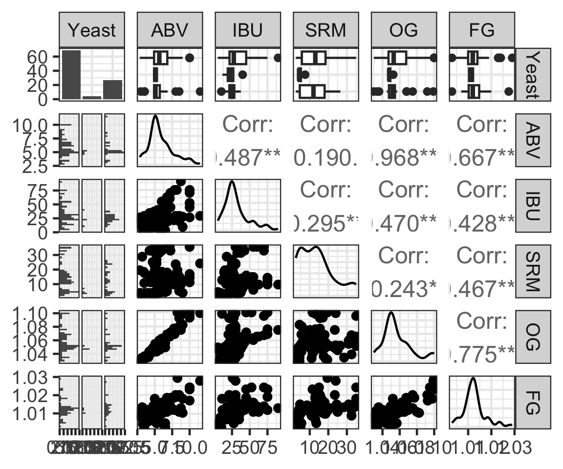
Excellent. If we look a the data now, we can see that there are a moderate amount of correlation between data types and all of the characteristics are spread reasonably well across the Yeast types. Here is a pairwise plot of all the data using the GGally::ggpairs() function.
Principle component analysis (PCA) is a translation of the original data into new coordinate spaces. This has absolutely nothing to do with the relationship among the data themselves but is more of a way to create new coordinates for each data point under the following criteria:
1. The number of axes in the translated data are the same as the number of axes in the original data. 2. Axes are chosen by taking all the data and finding transects through it that account for the broadest variation in the data. 3. Each axis is defined as a linear combination of the original axes. 3. Subsequent axes must be orthoganal to all previous ones (e.g., at 90\(\deg\) angles). 4. The amount of the total variation in the system can be partitioned by these new axes and they are ordered from those that explain the most variation to those who explain the least.
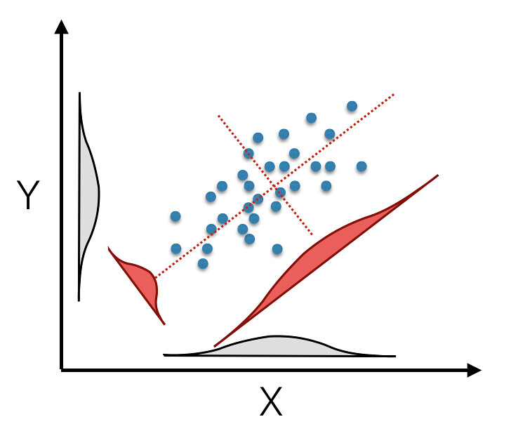
An exmaple of this rotation is given below.
A rotation of 2-dimenational data from the original coordinate space (represented by the x- and y-axes) onto synthetic principal component (the red axes). The rotation itself maximizes the distributional width of the data (depicted as density plots in grey for the original axes and red for the rotated axes).
To conduct this rotation on our data, we use the function prcomp(). It does the rotation and returns an analysis object that has all the information we need in it.
pc.fit <-prcomp(beers[,3:7])names( pc.fit)
[1] "sdev" "rotation" "center" "scale" "x"
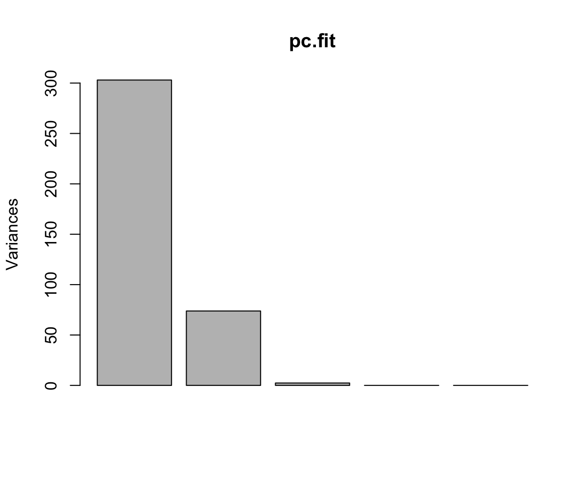
If we look at the raw analysis output, we see a summary of the amount of data explained by each of the axes as well as the loadings (e.g., the linear combinations of the original data that translate the old coordinates into the new ones).