Correlation In Class Activity
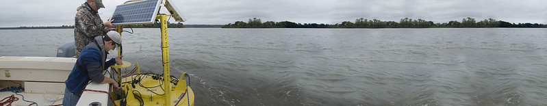
For this exercise, we are going to go back to work with our beloved Rice Rivers Center data to examine the following questions:
- Look up the library
GGally, it has a function namedggpairs(). Use that function to plot the atmospheric data from the Rice Rivers Center.
- For those atmospheric data, what which pair of variables have the strongest correlation? What is the 95% confidence interval on that correlation coefficient?
- Using the first 40 observations in air temperature and barometric pressure from the Rice Center data set, determine if they are individually distributed as a normal random variable.
- Given your findings in the last question, what kind of correlation statistic would be most appropriate for estimating the correlation between this subset of data?
- Look at a
qqnorm()plot of the barometric pressure data you used in the previous example. Is there something that ‘looks’ odd with these data? Explain, why those data are the way they are.
- Using a permutation approach, define the distribution of correlation values between the variables in #3 assuming that the NULL hypothesis is actually true. Plot these as a histogram and include the observed correlation.